

Process
I have been touched by the refugee crises in Europe and surprised at the reactions of people responding to those who have fled their homes in fear of their lives. Fear is a powerful thing and even though there is a risk that ISIS may infiltrate into other countries through the refugees, it does not undermine the fact there are millions of genuine, scared people, half of whom are children, fleeing from war and terror.
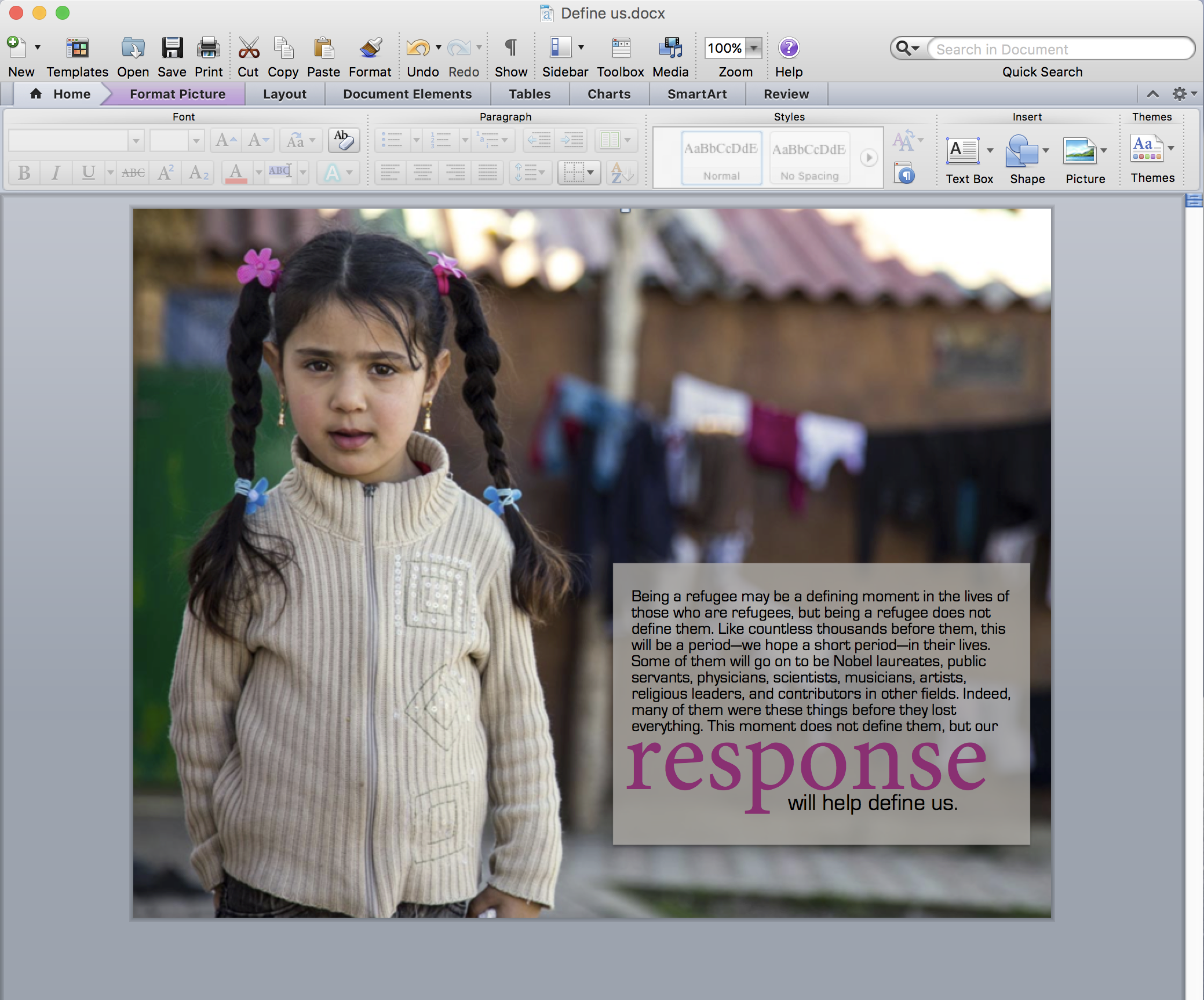
When the talks were given in general conference, I was touched by Elder Patrick Kearon’s talk. I decided to quote him and use an image that portrayed the children who are the real victims of this crisis. I found a picture on Save The Children foundations website, which I thought was appropriate. This little girl could be your little girl. My audience was humanity, and I hoped this would appeal to all who considered refugees were just grown men and not realizing that half of the refugees are innocent children.
I liked this particular image because the focal point was the little girl and she was placed perfectly in the rule of thirds, leaving room for text beside her. I pulled the color of the flowers in her hair to make the larger word on the text. This pulled her to the text and the pink sweater, hanging on the clotheslines in the background.
Critique Report
Stephanie Huston Bowen It looks good, it is a little hard to read because of the background.
Elizabeth Alonzo-Rivera You may want to change the color of the fonts and maybe put the title on top.
Kirsten Larson –In a video critique my instructor mentioned she liked the way I pulled the colors together. She suggested the letter “R” be lower case and the “W” so that the paragraph flows. She also suggested raising the word response to line with the text. Another thing she noticed was that the shape around the text was too small and did not give room around the text. Lastly, the image was not “full bleed” and needed to be changed.
Changes made to project
I followed all the advice my teacher gave me, treating her as the client who wanted certain things changed. I agreed with Stephanie that the font was hard to read, so I changed it to black, and decreased the opacity of the shape box behind it. This made the text much easier to read. The reason I did not change the font color of the title or move the word to the top was because I had deliberately picked the pink to match the flower in the little girls hair. The word was placed where it fit in the sentence.
Font Name and Category
Title: Minion Pro, old-style serif
Body Text: Eurostlye, sans serif
Image taken from:

I love the little changes you made really makes the word stand out!
LikeLike
Wow! Nice job! This really turned out great. I do love the color of the word “response” and how that really works well. I like the changes you made. You have worked hard and it shows.
Check out this blog now: https://knelson5blog.wordpress.com/category/design/
LikeLike
I really think your final project is really good. I love the picture and how you connected it with the text by using the color of her hair bows. Very nicely done!
https://knelson5blog.wordpress.com/category/design/
LikeLike
I like how you incorporated the picture with the quote. I like the story behind this picture. It made think of how many people are suffering and have to look for happiness in another place. i will definitely post this picture in my room
LikeLike
Thank you Liz, I really think we need to consider how we woud want people to help us, and then do that for those in need.
LikeLike